Frankfurt - city brand
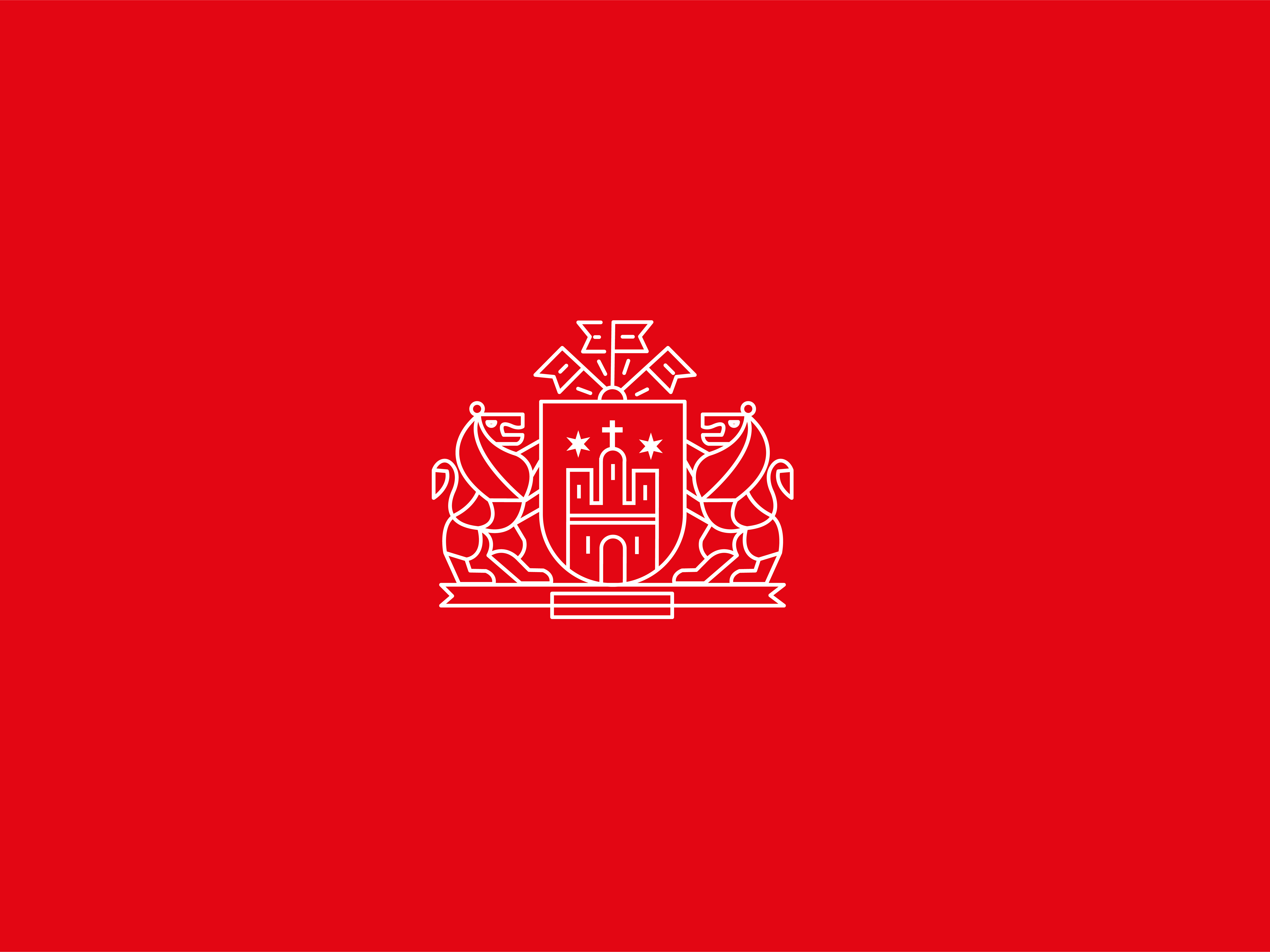
Redesign of the Brand for the city administration and promotion logo for Frankfurt. The emphasis is on the visual language, which combines the historical symbol of the city (coat of arms, eagle) with advanced features (economy, transport, security and service for residents). In these modern times the city is a centre of social, cultural and economic life. The logo and corporate identity are simple and modern, yet playful at the same time. Great importance is placed on simplicity of the message and straightforwardness of communication between the city administration and its inhabitants, tourists and other broader public. By unifying the Brand, Frankfurt will be even more recognized as an effective and successful city.
